Live Well Team
1 Faculty Advisor
1 Fellows
1 Graduate Student
3 Co-Ops
CBDI Team
Multidisciplinary Clinical Team


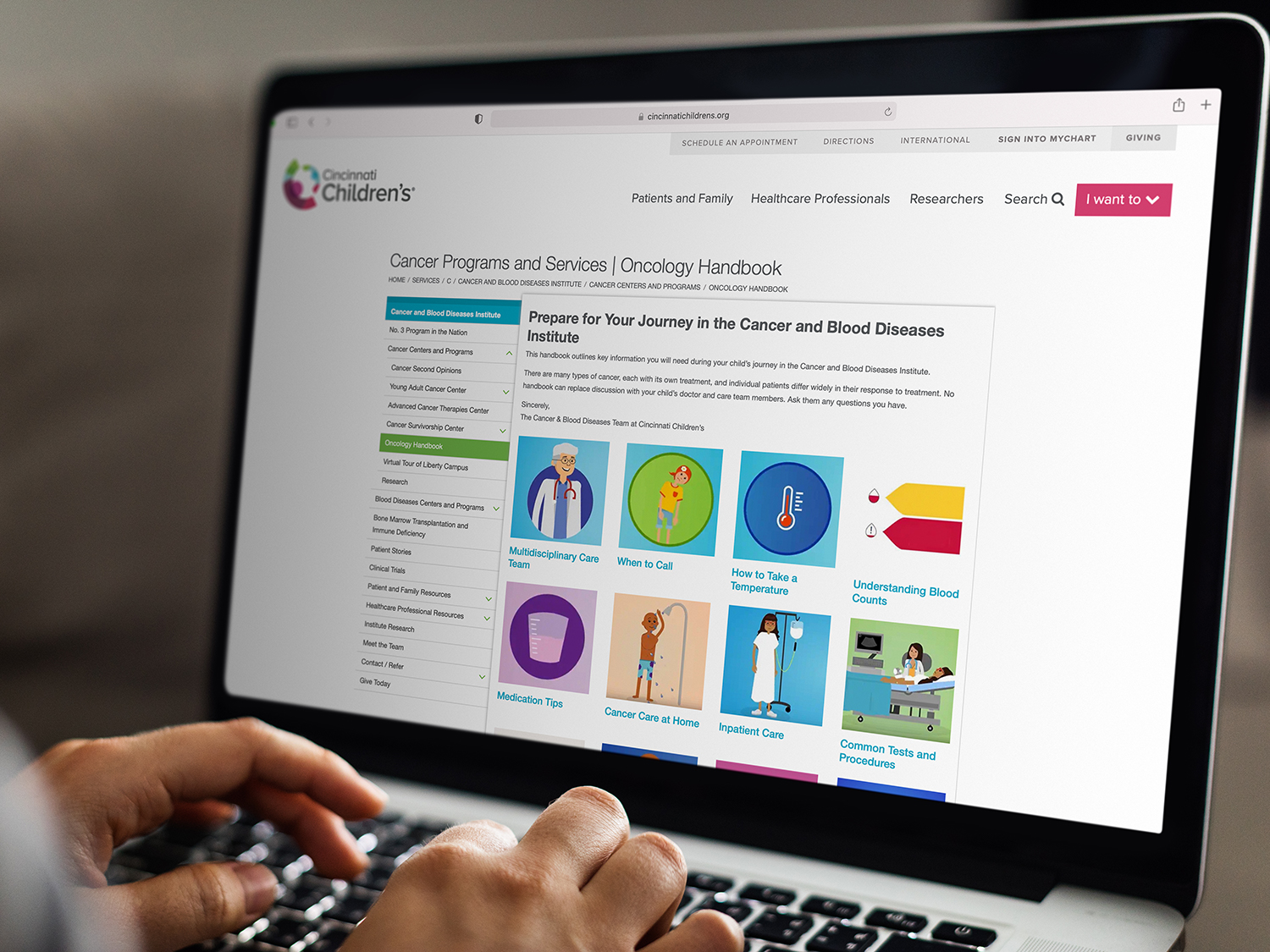
Improving the accessibility and usefulness of common care information
Information overload. For years, newly diagnosed patients and their families received a large three-ring binder containing hundreds of pages of dense text and few images that covered everything they may need to know about their diagnosis. The binder was comprehensive but overwhelming, expensive to produce, and more importantly, had outgrown its usefulness as patients and their families grew more accustomed to seeking information online.
Despite this emerging level of comfort, there remained a valuable need for a physical artifact that healthcare staff could use to present and discuss common care information, and that patients and their families could have readily available for quick reference when the need arises.
Live Well Team
1 Faculty Advisor
1 Fellows
1 Graduate Student
3 Co-Ops
CBDI Team
Multidisciplinary Clinical Team
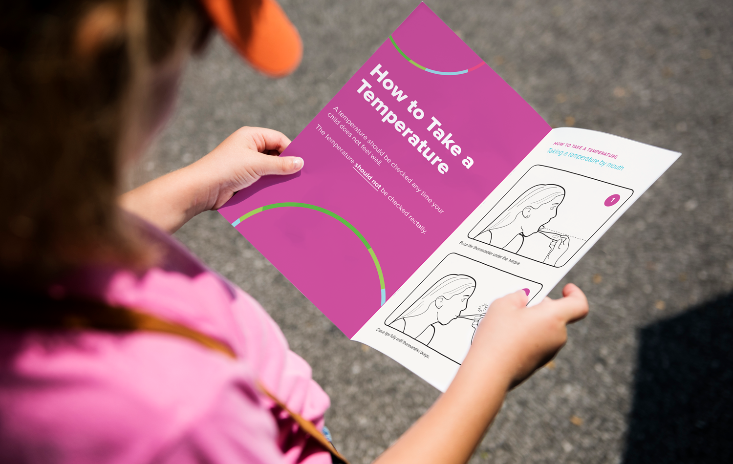
Sometimes a picture IS worth a thousand words. Take complicated concepts that are currently presented exclusively as text and translate them into images that are more effectively communicative.
The binder has become a wasteful use of resources. It’s expensive to produce and the information it contains rarely gets referenced.
Take the most commonly accessed information and present it so that it’s easily accessible and understandable “at-a-glance.”
80
55
03
The redesigned handbook could be produced at just 20% of the cost of the original binder.
Former patients and their families were engaged in the process to gain helpful perspective on how the information contained in the original binder was being used and how it might be presented in a more accessible, informative, and useful manner.
To accommodate the needs of our growing population of patients and families whose primary language isn’t English, the two handbooks — one designed for the unique needs of our Adolescent and Young Adult patients — are available in English, Spanish, and Arabic.
What We Did
Interviewing
User Research
Print Design
Layout Design
Medical Design

The newly designed oncology handbook focuses on only the most commonly referenced content by patients, families, and care managers. Imagery complements text, making the presentation of common care information more engaging, accessible, and understandable, especially for those with lower health literacy. Measuring in at only 5” x 8.5”, the format is more easily transportable, fitting comfortably in a bag or back pocket, making reference to the information more convenient. The result is a more informed patient population at a fraction of the cost.